|
Technique -
Technique
|
COLORS, COLORS, COLORS!
Image composition is about light and light
is about contrast/brightness and colors. It is either a good idea to surpress
as many different colors as possible (resulting in monochromatic
pictures when going to the extremes) or to make use of color contrasts
by looking for complimentary colors - red, green & blue. The more pure
the base color the more extreme is the difference (color contrast) making
an image interesting. There're various possibilties to increase color saturation
and therefore contrast. Polarizers are the most popular option. These filters
work pretty good to enhance the blue sky or shiny objects like the sea
or other non-metallic object. The effect is maximized at a position 90
degrees of the sun. Often it is a good idea not to go for the max here.
Graduated color filters can help as well here and there. There're also
various sorts of direct color enhancers like "Redhancer" filter etc. pp.
Just make sure that you know what you're doing ...
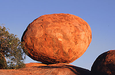
Anyway, the following picture is a quite
typical example for contrasting colors - here red vs blue.
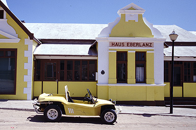
The next picture illustrates that we still
get a interesting picture with a very limited range of colors. Just this
limitation makes a pictures often interesting because it's simply so unusual.
by Horst Schneider
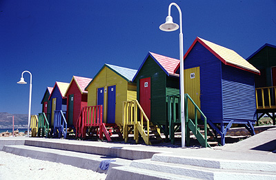
You can have a beautiful composition of
a great subject but there're actually few things that are more impressive
than extremely colorful scenes - such pictures immediately suck all the
attention of a viewer. Just make sure that you handle such subjects with
case because the effect is usually limited to the initial surprise of the
viewer.
|
|