|
Sony FE 24-105mm f/4 G OSS (SEL24105G) - Review / Test Report - Analysis |
|
Lens Reviews -
Sony Alpha (Full Format)
|
|
Page 2 of 3

Distortion
RAW Image distortions are not exactly a strength of the Sony FE 24-105mm f/4 G OSS, which is probably why Sony decided that you can't even disable
distortion auto-correction in the camera menu. Thus normally, you won't really have much of an issue here anyway.
There's a minimal degree of barrel distortion at 24mm and slight pincushion distortions in the mid-range.
When looking at the RAW characteristic, things aren't that shiny anymore. The barrel distortions are heavy at 24mm (~4.6%), and the pincushion distortions
towards the long end aren't nice either (3+%). So we can conclude that the lens isn't really meant to be used without distortion auto-correction.
Vignetting
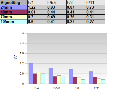
The same applies when looking at the vignetting characteristic. With activated auto-correction, you may spot some moderate vignetting at 24mm and 40mm @ f/4, but other than that, there's barely any light falloff to be concerned about.
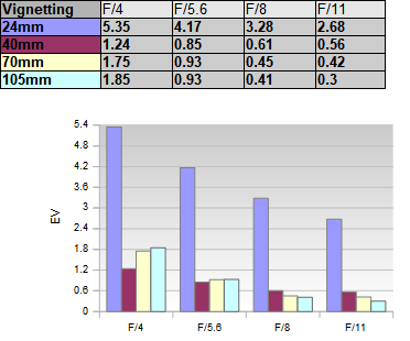
 If you disable both distortion and vignetting correction, things are very different here, though - specifically at 24mm. The extreme corners are
essentially black in this case (please note the very different scale in the chart below) - thus, the lens has been clearly underdesigned.
Or in other words - the front element is too small. Please note that this sounds worse than it is. If we accept that distortion auto-correction
is really the default - and that's what Sony has configured - those black corners are gone.
 Just to give you an idea about the native vignetting at 24mm f/4 - here's a sample image:

MTF (resolution)
Let's have a look at the resolution characteristic of the Sony FE 24-105mm f/4 G OSS now. We are happy to report that things are quite pleasing here (for a standard zoom lens tested on a 42mp sensor). At 24mm, a broad center zone is tack sharp (within the usual diffraction limits). The border quality is good to very good, even at f/4. The corners aren't superb, but they are still in the "good" range. The outer image field is very soft at 40mm f/4 but improves substantially when stopping down to f/5.6 with good to very good results here. The borders/corners recover at 70mm, although they could still be better at f/4. The results are pretty nice from f/5.6 once again. At 105mm we can observe a more pronounced drop of the center performance at f/4 although the quality remains very good here. The outer image field is soft f/4 again, but it's back to very decent quality at f/5.6
The centering quality of the tested sample was Okay, but typically for stabilized lenses, there were some variations.
Please note that the MTF results are not directly comparable across the different systems!
Below is a simplified summary of the formal findings. The chart shows line widths per picture height (LW/PH) which can be taken as a measure of sharpness.
If you want to know more about the MTF50 figures you may check out the corresponding Imatest Explanations
Chromatic Aberrations (CAs)
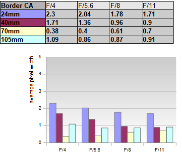
The amount of lateral chromatic aberrations (color shadows at the image borders) is good for a lens in this class. The lateral CA's are visible at 24mm with a peak of 2.3px on average at the image borders, decreasing to 1.7px when stopping down. The CA decrease towards the midrange and increase only slightly at 105mm again.
Bokeh
A 24-105mm f/4 is not a master when it comes to shallow depth-of-field photography. However, at longer focal lengths, you can still achieve some decent object isolation in many scenes, so let's have a look at the bokeh (quality of the out-of-focus blur).
Out-of-focus highlights have a circular shape at f/4 and the lens manages to keep this up till f/8, which is unusual. The inner disc is fairly busy, with an onion-like substructure and some outlining. That's not unusual in this lens class, though. Most likely, this relates to the use of aspherical elements, and the Sony FE 24-105mm f/4 G OSS has 4 of them.
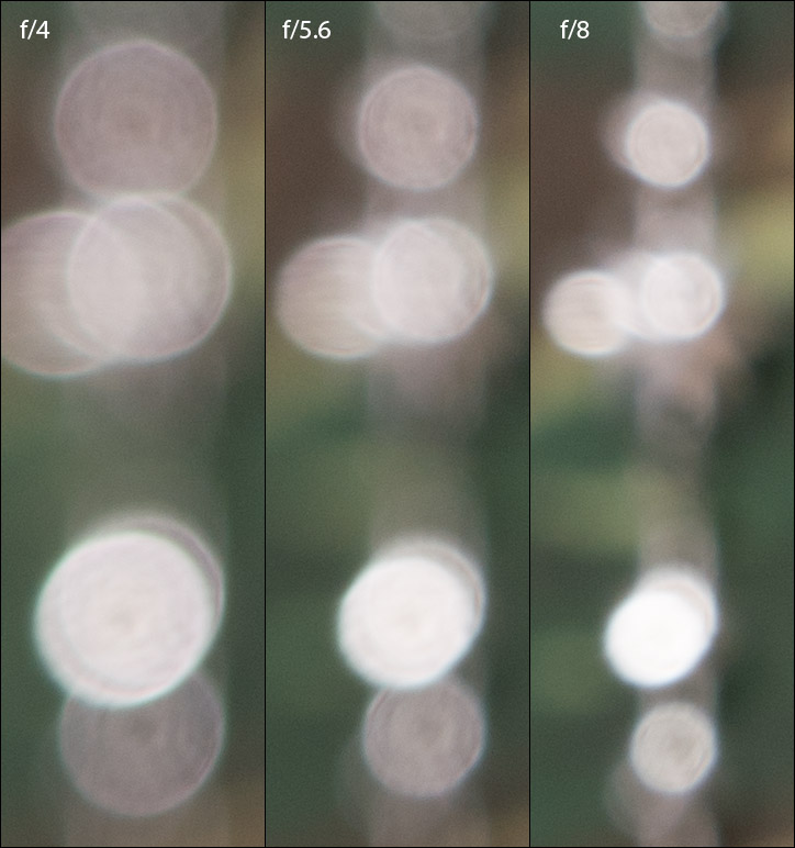 Near the borders, the circular discs deteriorate to "cat eyes" (more like circles that are cut in half).
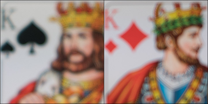
The general blur in the critical focus transition zone is pretty good in the critical image background (left image crop below). The foreground (to the right) is somewhat edgier at contrast transitions.
|